What is the impact of shading and windbreak strategies on seasonal outdoor comfort throughout the day?
Project Location: Zone 0A Extremely Hot Humid
Simulation Scale: Single-Aspect Analysis
Application: Real Project
Audience: Architect/Designer
What is this graphic showing? Describe the different parts of the graphic and how it communicates the data.
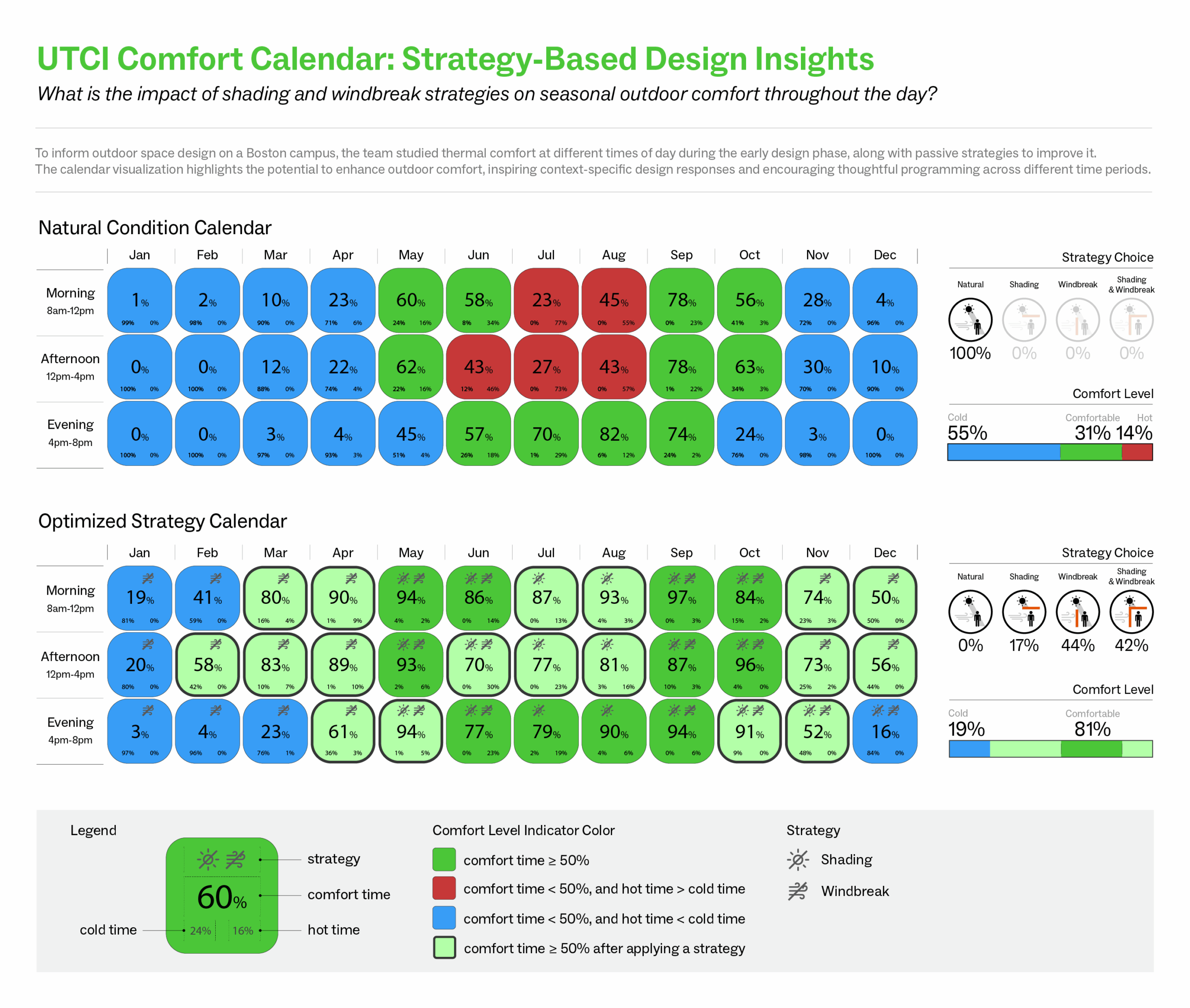
Using UTCI as the outdoor comfort metric, the first calendar illustrates thermal comfort levels across morning, afternoon, and evening periods under natural conditions. The second calendar shows the improvement after applying optimal passive strategies—shading and windbreaks—tailored to each time slot. These insights are intended to guide early-stage site design decisions for outdoor comfort.
What type of graphic is this?
- Analysis grid
Design Variables
- Passive strategies
What tools were used for the simulation analysis?
- Ladybug Tools
What tools did you use to create the graphic?
- Adobe Illustrator
What was successful and/or unique about the graphic in how it communicates information?
Comparing to a classic UTCI heat map, the graphic uniquely combines time-of-day and monthly analysis into an intuitive calendar format, enabling quick insights into outdoor thermal comfort. Its side-by-side comparison of natural and optimized conditions clearly shows the effectiveness of passive strategies, making complex data easily actionable for early design decisions.
Is there anything else you would like to mention?
This graphic is not only effective for building scientists and designers—it also resonates with clients and the public. By using a clear, intuitive format, it invites a broader audience to engage in conversations about outdoor thermal comfort, seasonal programming, and passive design strategies.
Additional credits and other contributors:
Elaine Hoffman, Director of Sustainability, Goody ClancyIncluded in the competition:

2025 Annual Project StaSIO Challenge - Deadline May 27th, 2025
March 20, 2025-June 5, 2025